
Hey there! Ready to level up your web design game? Visual hierarchy is the key to creating interfaces that just “click” with users. It’s all about strategically guiding their focus using size, colour, spacing, and other design principles. This guide dives deep into visual hierarchy’s superpowers and how to wield them like a pro.
Understanding the Basics of Visual Hierarchy
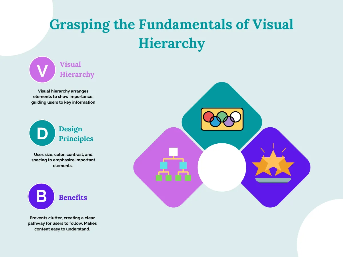
Visual hierarchy means arranging elements on a website in a way that shows what’s most important. It guides people’s eyes to find key information easily. In general, our brains naturally look at bigger, brighter, and more colourful things first. Visual hierarchy uses design principles like size, colour, contrast, and spacing to highlight crucial elements.
For example, making a “Buy Now” button larger and brighter than other text draws attention to it. Furthermore, proper visual hierarchy saves a website from looking cluttered or confusing. It creates a clear pathway for people to follow, helping them understand the content and find what they need quickly. All in all, good visual hierarchy is like having a friendly tour guide – it makes exploring websites an enjoyable and intuitive experience.
The Role of Size and Scale
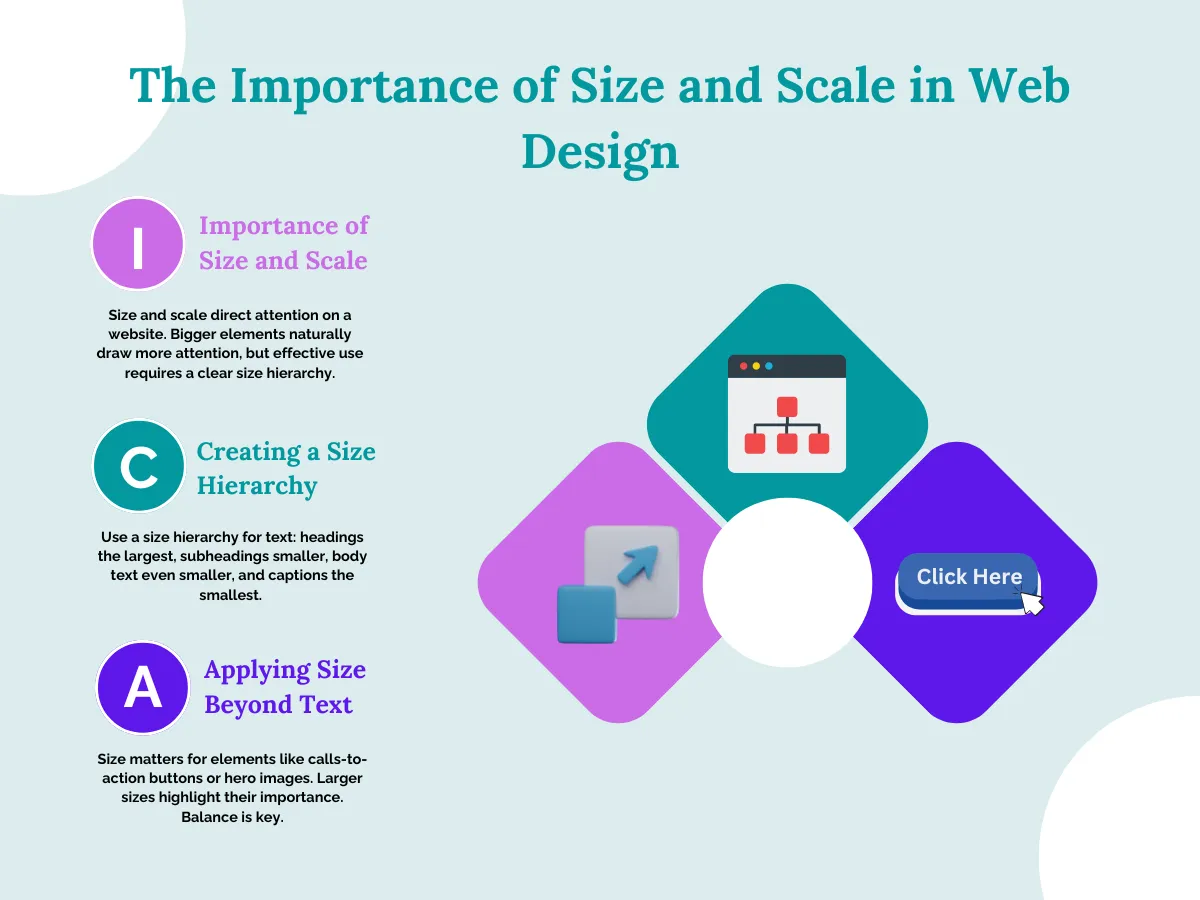
Size and scale play a huge role in directing people’s attention to a website. The bigger an element is, the more our eyes get naturally drawn towards it. However, using different sizes effectively is about more than just making the most crucial items the biggest. You need to create a clear size hierarchy to separate the main content from supporting information.
A good technique is to make headings the largest text, then subheadings slightly smaller, body text even smaller, and finally captions or other minor details at the smallest size. This gradual decrease in size guides viewers step-by-step through the content.
Size matters beyond just text too. Making calls-to-action buttons or hero images physically larger than surrounding elements instantly highlights their importance. But you don’t want things too big or too small – finding the right balance through scaled sizing prevents messy, overwhelming layouts.
Colour and Contrast
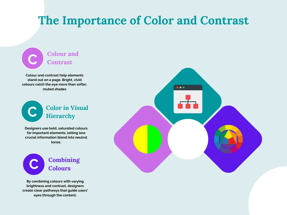
Colour and contrast make certain things stand out on a page. You may have seen that bright, vivid colours instantly catch your eye compared to softer, muted shades. For visual hierarchy, designers often use one bold, saturated accent colour to highlight the most important stuff, while letting less crucial information blend into neutral background tones.
You can see that a website like vecteezy.com use a complementary colour scheme like black text in navigation menu on a white background, with orange as a theme colour, just to create a clear separation and sense of priority. So by cleverly combining colours with varying brightness and contrast levels, designers can create clear pathways that naturally guide your eyes through the content.
Spacing and Grouping Techniques
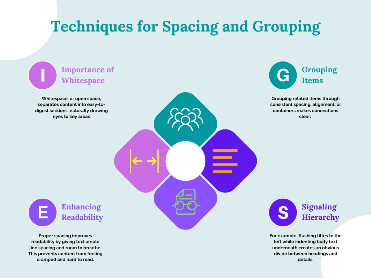
Spacing and grouping go hand-in-hand to create clean, well-organized layouts that highlight what’s important. Using plenty of open space, called whitespace, separates content into easy-to-digest sections that naturally draw eyes toward key areas. Plus, grouping related items together through consistent spacing, alignment, or containers makes clear connections between those elements.
Proper spacing improves readability too. Giving text ample line spacing and room to breathe prevents things from feeling cramped or hard to read at a glance. Similarly, smart alignment cues also signal hierarchy – for instance, flushing titles to the left while indenting body text underneath creates an obvious divide between headings and details.
Overall, using spacing and grouping purposefully transforms messy content into structured, skimmable experiences where priorities are visually apparent. Open space focuses attention while unified groupings foster comprehension.
Using Images and Icons Effectively
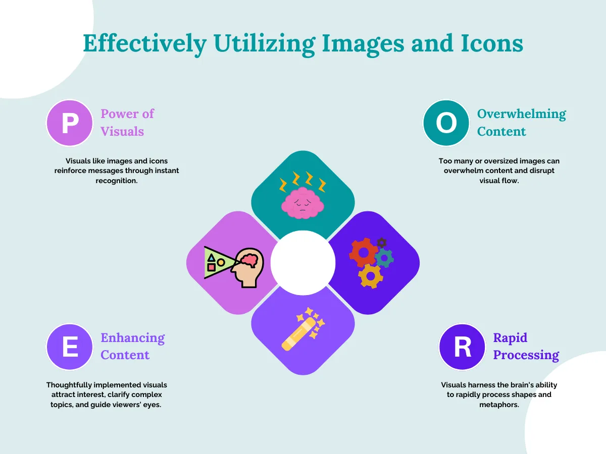
While words convey information, visuals like images and icons have a powerful ability to reinforce messages and storytelling through instant recognition. A large, vivid hero image or graphic grabs attention right away, quickly communicating core ideas. However, including too many or oversized images can backfire by overwhelming content and disrupting the visual flow.
The key is purposeful integration – visuals should enhance text narratives, not distract or dominate layouts. When thoughtfully implemented, imagery punctuates content hierarchy by attracting interest, clarifying complex topics, and guiding viewers’ eyes along an intended path. Visuals harness our brain’s ability to rapidly process shapes and metaphors while complementing – not overtaking – the core content’s informational structure. As discussed in detail in our guide on Applying the Rule of Thirds to Web Design for Enhanced Visual Hierarchy, visuals should support and enhance the core content’s informational structure.
Implementing Layout Patterns
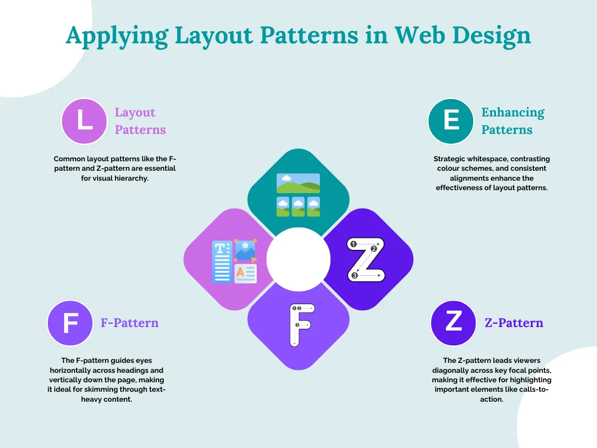
While designing interfaces, leveraging common layout patterns like the F-pattern and Z-pattern is crucial for establishing visual hierarchy. These patterns tap into how people’s eyes instinctively scan content. For instance, the role of the F-pattern is to guide eyes horizontally across headings before tracking vertically down the page. Alternatively, Z-patterns lead viewers diagonally across key focal points
Moreover, reinforcing such patterns through strategic whitespace utilization, contrasting colour schemes, and consistent alignments further accentuates hierarchy. A classic example could be a homepage with the company’s branding and primary navigation following F-shaped lines, whereas prominent calls-to-action occupy the Z-pattern’s diagonal vectors.
Interactive Elements and Visual Hierarchy
Interactive elements like clickable buttons, tappable links, and subtle animations don’t just make websites functional – they also guide people’s attention and actions. These interactive bits use eye-catching styles like bright colours or delightful hover effects to draw your focus towards important actions. Plus, where they’re strategically placed on the page signals what’s most important. A big “Get Started” button front-and-center naturally stands out more than smaller side links.
Similarly, an FAQ page could use a simple “Show Answer” button to reveal details, keeping the focus on the article text. Or an e-commerce gallery could use product thumbnails that enlarge with a smooth transition when hovered over. Subtle interactions like these enhance usability without stealing the spotlight from the main content.
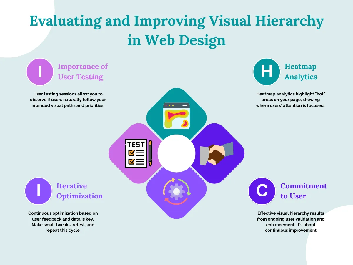
Testing and Refining Visual Hierarchy
Creating an effective visual hierarchy involves testing and iterating based on real user feedback. User testing sessions let you observe if people’s eyes naturally follow your intended paths and priorities. Plus, heatmap analytics visually highlight the “hot” areas getting the most attention.
The key is continuously optimizing hierarchy based on hard data and observations. Make small tweaks, then retest – this iterative cycle steadily improves user engagement over time. After all, good visual hierarchy results from an ongoing commitment to user validation and enhancement, not a set-it-and-forget-it approach.
Conclusion
Visual hierarchy is a constantly evolving craft – what works today may not cut it tomorrow. The most successful designers stay curious, test relentlessly, and iterate based on real user behaviors. It’s an ongoing journey of optimization and enhancement. But when you nail that seamless blend of clarity and engagement? That’s web design sorcery right there. So keep exploring, keep pushing boundaries, and never stop leveling up that visual hierarchy game!