
Before delving into the main topic, it might be beneficial to revisit the basic tenets of UI Design, both as a refresher for those with a rudimentary understanding and as a primer for the uninitiated. So, with that in mind, what exactly is UI design? User Interface design is the process of creating the visual elements that allow a user to interact with a digital product or service, such as a website, mobile app or software application. It’s all about designing the screens, buttons, menus, icons and other visual components that users see and interact with.
As a result, there is an element that makes people think, perceive, and interact with digital interfaces. It’s about using psychological principles and insights to create user interfaces that are intuitive, easy to use and aligned with the way people naturally process information and make decisions.
This is where psychology comes into the picture of UI design. Certain psychological principles can be applied in the designing of a website, so that it appeals to a large number of users, and this in turn, can attract more users to that particular website.
The Power of First Impressions
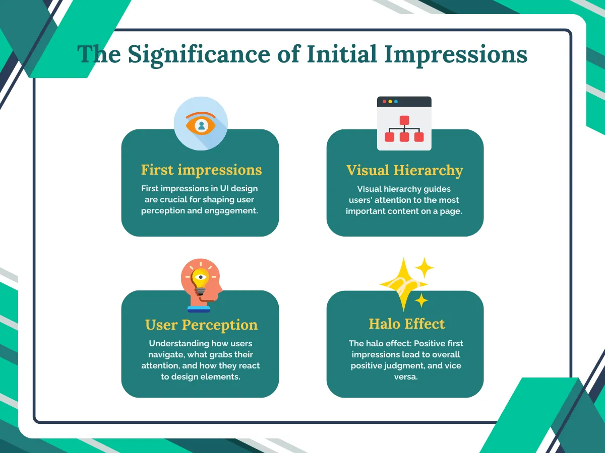
One aspect of this is the idea of user perception. Essentially, it involves understanding how users navigate websites, what grabs their attention, and how they interpret and react to different design elements. This analysis might include studying eye-tracking patterns, scrolling habits, and click-through rates.
Once this is thoroughly examined, the next step is to consider how the site’s visual appeal can be improved to encourage regular visits. This involves a concept known as visual hierarchy, which guides users’ attention to the most important content on a page. Visual hierarchy involves adjusting elements such as size, color, contrast, and positioning to highlight specific information.
One of the psychological principles that plays a factor in this is the halo effect. It is a concept that states that when a person experiences a positive first impression, it’ll lead to an overall positive judgement and vice versa for a negative first impression. In terms of UI design, if a user finds a website visually appealing and easy to use initially, they’ll likely have a favourable overall opinion of it. However, if their first experience is negative due to poor design, they may harshly judge the entire website, despite any positive aspects. The initial visual appeal and usability create a “halo” effect that colors the user’s total perception. This emphasizes the importance of great UI design for that crucial first impression.
Color Psychology
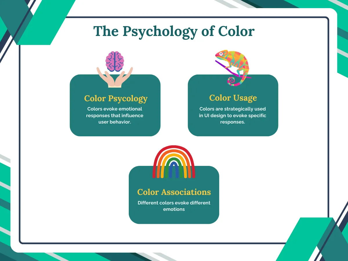
There is an inane quality attached to a color that evokes a response from a user once they see it. Now, that response can vary from user to user but for the most part, there is a generally accepted emotional response that corresponds with a color. For example, red is usually associated with love and excitement. As such, it tends to make an individual breathe faster and increase their heart rate. And this is why red is often used on a website in order to draw attention to something and then, create a sense of excitement. On the flipside, it is also seen in negative associations like anger, war, fire blood, etc. Similarly, blue is often seen as calming or trustworthy and it is precisely for that reason that corporations and banks tend to use that color in their websites as it is non-invasive and conveys a sense of dependability to the users. These are but a few of the examples when it comes to color and how it can be used to psychologically influence the user out there.
The Principle of Fitts’ Law
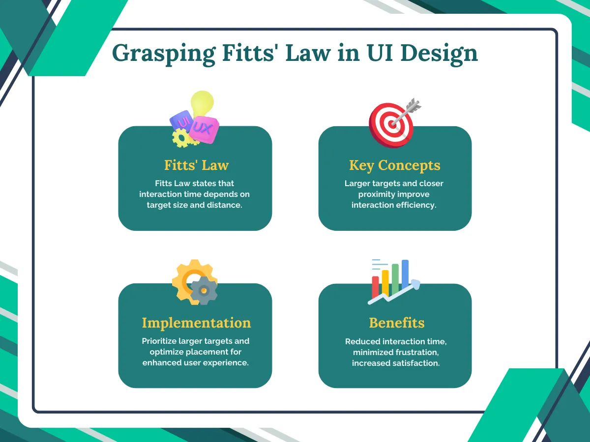
Fitts’ Law states that the time it takes to move and click on a target area is based on the size of the target and the distance to it from the mouse cursor. Basically, the bigger the target area (like a button) and the closer it is, the faster and easier it is for users to click on it.
In web design, this means making clickable elements like buttons, links, and menu items nice and large as well as placing them in areas that don’t require users to travel too far across the screen. If the website sticks to this principle, then it makes the interactions more efficient and user-friendly by reducing the time and effort required.
However, the main concern is to remove any and all potential frustrations by ensuring important interactive elements are easily reachable and have ample target areas. In this way, the user will go back pleased with having a positive experience and thereby, ensure that the word-of-mouth passes along quickly.
The most apparent implication of this principle is to prioritize larger targets. Fitts’s law demonstrates that users will navigate more quickly when interacting with larger clickable, tapable or hoverable elements. Moreover, the frequency of errors decreases as the size of targets increases. As for the placement of the targets, as stated earlier, having them be in close proximity to each other will result in a positive experience for the user.
The Psychology of Choice
Cognition, the process of how users gather, process, and remember information, is crucial in UI design. Users must understand how an interface functions and navigate it efficiently. Overloading users with too much information can strain their cognitive abilities and make tasks harder to complete. To avoid this, websites should use simple language, bullet points, and lists to organize information in a user-friendly way.
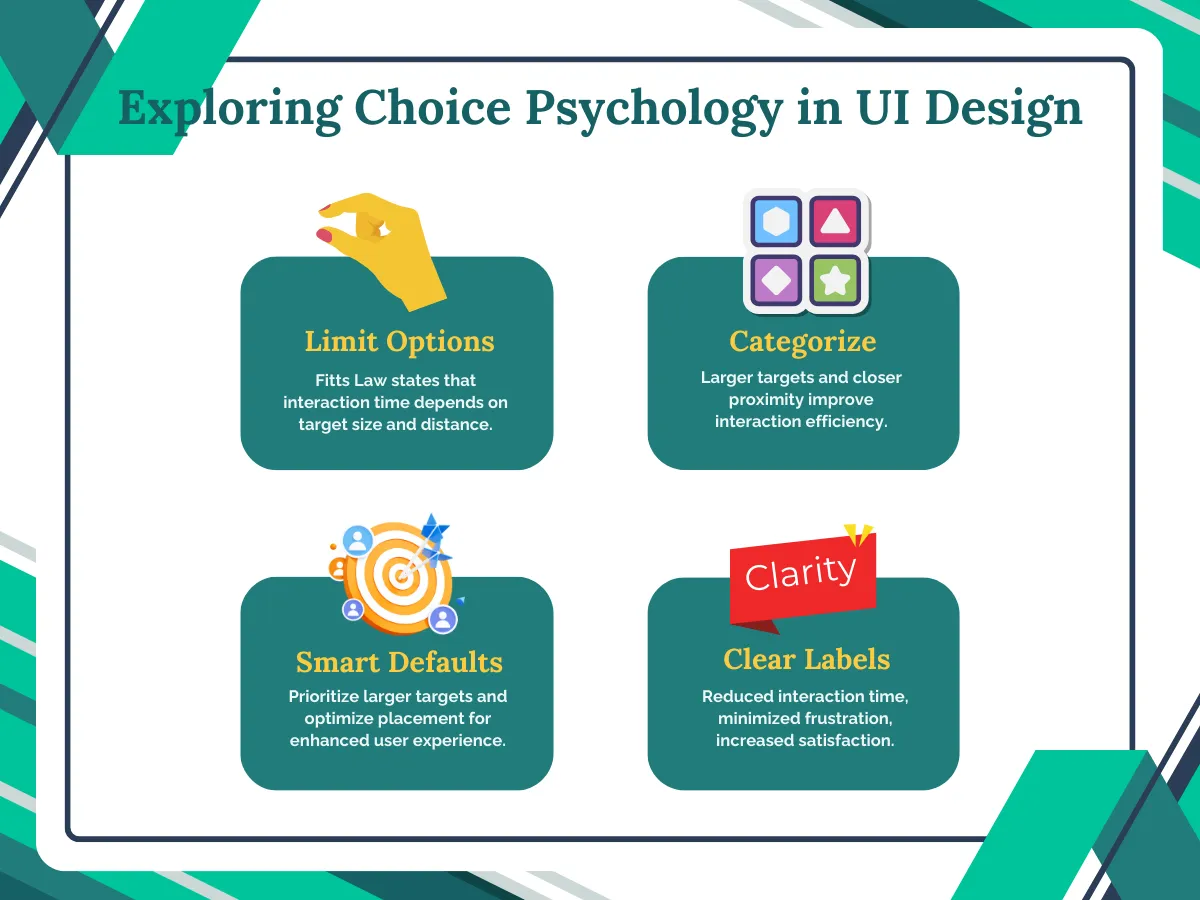
With that said, here are a few ways in which the designer can make sure to structure the choices in UI without causing decision fatigue:-
- Limit Options: Offering too many choices can overwhelm users and make decision-making difficult. Aim to present only the most essential and relevant options, removing any unnecessary or redundant choices.
- Group and Categorize: Organize choices into meaningful groups or categories. This helps users quickly scan and identify the section that’s most relevant to their needs, reducing the cognitive load of processing all options at once.
- Provide Smart Defaults: Offer sensible pre-selected default options that work for most users. This reduces the need for users to make decisions unless they have specific preferences.
- Use Clear Labels and Descriptions: Ensure that each option is clearly and concisely labelled, and provide additional context or descriptions if necessary to help users understand what they’re choosing.
Emotional Design
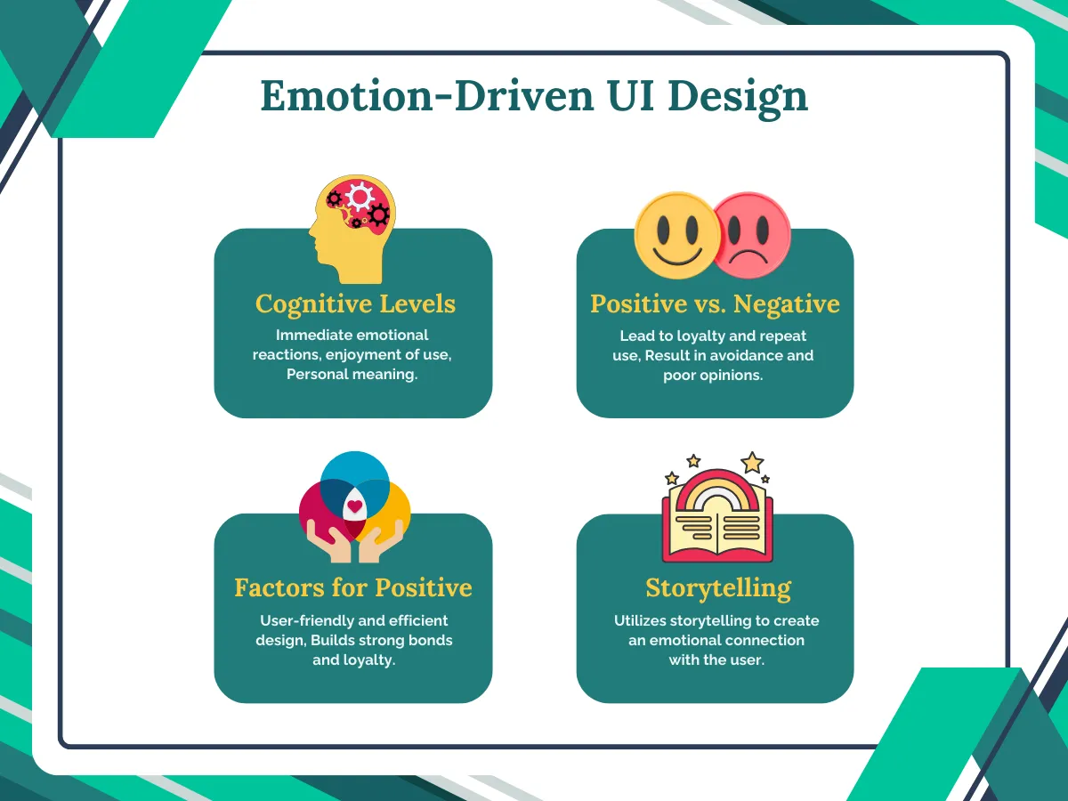
It is a concept where designs are created in order to evoke emotions which can result in positive user experiences. Designers strive to connect with users on three cognitive levels: visceral, behavioral, and reflective. In this way, users develop positive associations with products, brands, etc. In some cases, the association may entail negative emotions as well. However, if a person were to associate negative emotions with a particular brand or product, then it is unlikely that they will come back to it. In the case of a positive emotion though, it is the exact opposite as the person would be more than happy to continue revisiting the product. An example of this would be the Google search engine. In addition, the user would be far more forgiving of any minor usability issues as well. Now, one key factor that can evoke positive emotions towards a product is its perceived usability or ease of use. Another factor would be a strong emotional connection that is associated with a product and this can also contribute to favourable feelings toward it.
This is precisely the reason why it is advantageous to include storytelling in the process. A well-crafted story can captivate users and create an emotional connection with the product or service. By presenting information or features in a narrative form, designers can make the UI more engaging, memorable and relatable.
The Importance of Feedback
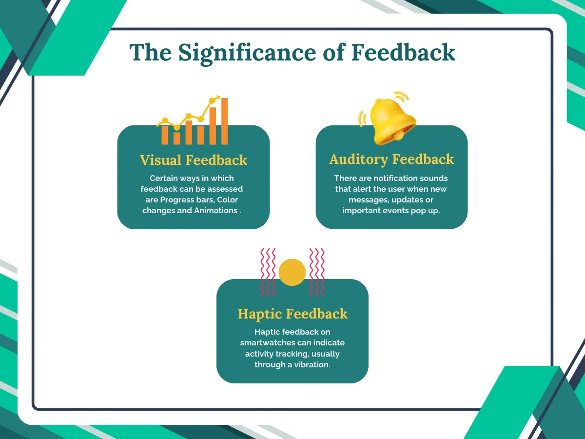
User interface design heavily relies on effective feedback mechanisms to create a seamless experience for users. It serves as the bridge of communication, conveying crucial information that acknowledges user actions. In other words, a proper feedback system lets the user know that the system noticed their action and is working on it. Its significance lies in its ability to reassure users that their input has been successfully received and is undergoing processing. In addition, feedback plays a vital role in providing users with insights and resolutions of any potential queries. It also offers guidance on navigating the interface effectively. By establishing this continuous loop of information exchange, feedback fosters a sense of transparency and control, ultimately enhancing the overall user experience.
There are certain ways in which feedback can be assessed –
- Visual: Progress bars are shown that indicate an ongoing process. Also, there are color changes in the interface and animations as well.
- Auditory: There are notification sounds that alert the user when new messages, updates or important events pop up.
- Haptic: Haptic feedback on smartwatches or fitness trackers can indicate activity tracking, goal completion, or incoming notifications usually through a vibration.
Conclusion
Designers should always look to psychology for new ideas to make their designs better by integrating psychological principles into UI design. This makes the entire process a bit easier to navigate as it makes the interface easy to use, intuitive, and also aligned with the way people naturally process information and make decisions.
By understanding how people think and behave, designers can create user interfaces that are easier to use. At the same time, getting feedback from users allows designers to see what’s working well and what needs improvement. This back-and-forth between applying psychological concepts and listening to user feedback creates a helpful cycle. Through this continuous process, designers can use insights from psychology to make interfaces that feel natural and intuitive for users. Overall, combining psychology with UI design in this way helps make digital products and services truly user-friendly.