
Introduction
Have you ever visited a website and felt…well, lost? Overwhelmed by messy layouts? Annoyed by hard-to-read text? You’re not alone. Without design fundamentals, websites easily end up disjointed and confusing.
But it doesn’t have to be that way! If you are someone interested in web design, understanding the website design fundamentals is absolutely essential to create websites that wow!
In this blog, we’ll explore essentials like typography, colour theory, and establishing visual hierarchies among other things. With command of these fundamentals, you can craft beautiful, functional websites that guide users seamlessly through immersive experiences.
Color Theory
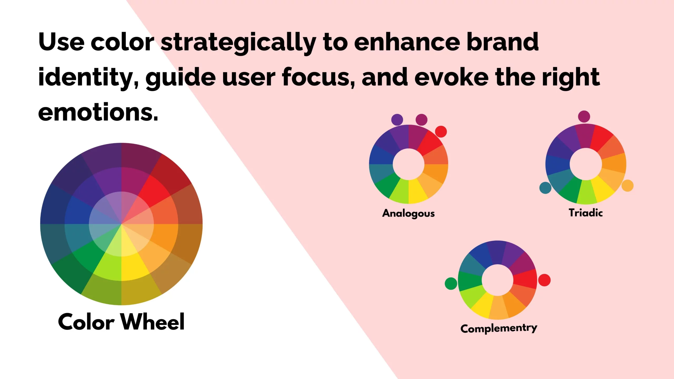
If you choose colours randomly without thinking about colour theory, you are making a mistake. Mastering the art of using colour theory in website design has many benefits, as colours are powerful tools for communication. For starters, strategic colour choices can weave together a memorable brand identity.
However, it goes beyond merely tying together your look and feel. Mastering contrasts, complementary schemes, and other colour theory principles elevates visual hierarchy and design clarity to the next level.
Contrast, for instance, can make key elements stand out, guiding the attention of your audience. For example, a call-to-action button in a colour that contrasts with the background will catch the user’s eye.
On the other hand, complementary colours, which are opposite each other on the colour wheel, can create a vibrant and dynamic look. For instance, a website for a beach resort might use blues and oranges to evoke feelings of relaxation and warmth.
Additionally, colour psychology plays a crucial role. Different hues can evoke distinct emotions and reactions. For example, a luxury perfume brand might use deep purples and elegant golds to convey opulence, aligning with their high-end products. Meanwhile, a children’s toy company might use fun, vibrant yellows and blues to spark joy and excitement.
It’s also important to consider cultural colour meanings, as connotations vary globally. Understanding regional differences is crucial for effective visual communication.
In short, diving into colour theory offers more than just aesthetic perks – it helps you strategically craft engaging designs that resonate with your audience.
Typography
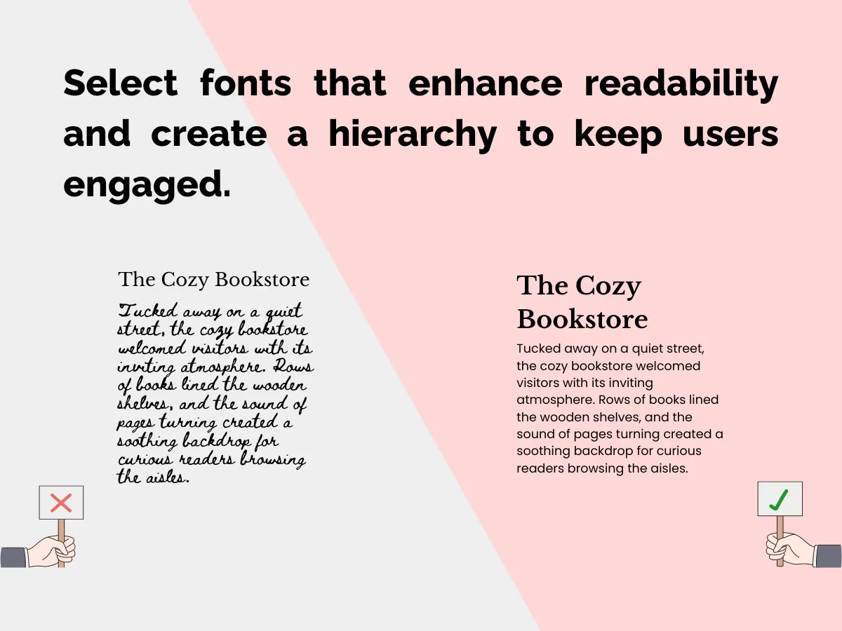
Typography in web design encompasses various elements that collectively shape the user experience, ranging from font selection to spacing and styling. Effective typography hinges on principles like readability, hierarchy, contrast, and consistency, each playing a pivotal role in enhancing website usability and engagement.
Consider readability, which ensures text is easily legible and comprehensible. This involves choosing appropriate font families and sizes to accommodate different screen sizes and viewing contexts. For instance, a recipe website might utilize a clean, sans-serif font for body text, enhancing readability across devices and platforms.
Hierarchy establishes the visual order of content, guiding users through the website’s structure. Headlines may feature a distinct font style or size to draw attention, while subheadings employ a subtle variation to denote secondary importance. This hierarchy aids users in navigating the content seamlessly, as exemplified in an online news platform where clear headings direct readers to specific articles or topics.
Contrast enhances visual interest and delineates different elements within a webpage. Utilizing contrasting font styles or sizes for headlines, body text, and captions can create a visually dynamic layout, as seen in how an e-commerce site incorporates varied typography to distinguish product names, descriptions, and prices.
Consistency fosters coherence and reinforces brand identity throughout the website. Maintaining uniformity in font choices, spacing, and styling across pages ensures a cohesive user experience. In the context of a portfolio website, consistent typography imparts a sense of professionalism and creativity, establishing trust with visitors.
Consider an example: Picture a recipe website where inviting headlines in a bold, serif font beckon users to explore delicious recipes. The body text, presented in a simple yet elegant font, harmonizes with accompanying visuals, ensuring seamless readability. Thoughtful spacing enhances navigation, allowing users to follow recipes effortlessly without distraction.
In essence, effective typography breathes life into website content, transforming mere text into engaging narratives. By adhering to principles of readability, hierarchy, contrast, and consistency, web designers can craft immersive digital experiences that captivate and inspire users.
Balancing Whitespace and Negative Spaces
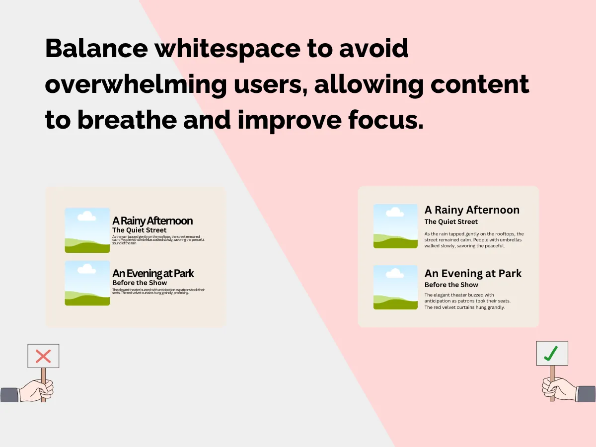
Cluttered spaces make poor first impressions— and this applies to websites too! As a web designer, it’s your duty to make the user experience through the website as smooth as possible. And, learning how to balance whitespace and negative space is key to providing that seamless navigation.
Too much information crammed together overwhelms users. Their eyes need room to breathe! Effective use of negative space creates that breathing room. It allows elements like text, images and buttons to stand out instead of blending together.
Strategic whitespace also establishes hierarchy, directing attention to what matters most. For example, generous padding around headings and sections helps these elements pop. Tight spacing, on the other hand, fades elements into the background.
Overall, generous whitespace creates visual clarity and cleanliness. This openness provides a smooth, enjoyable journey through the content. Users can focus on what intrigues them rather than feeling bombarded.
Achieving Design Coherence
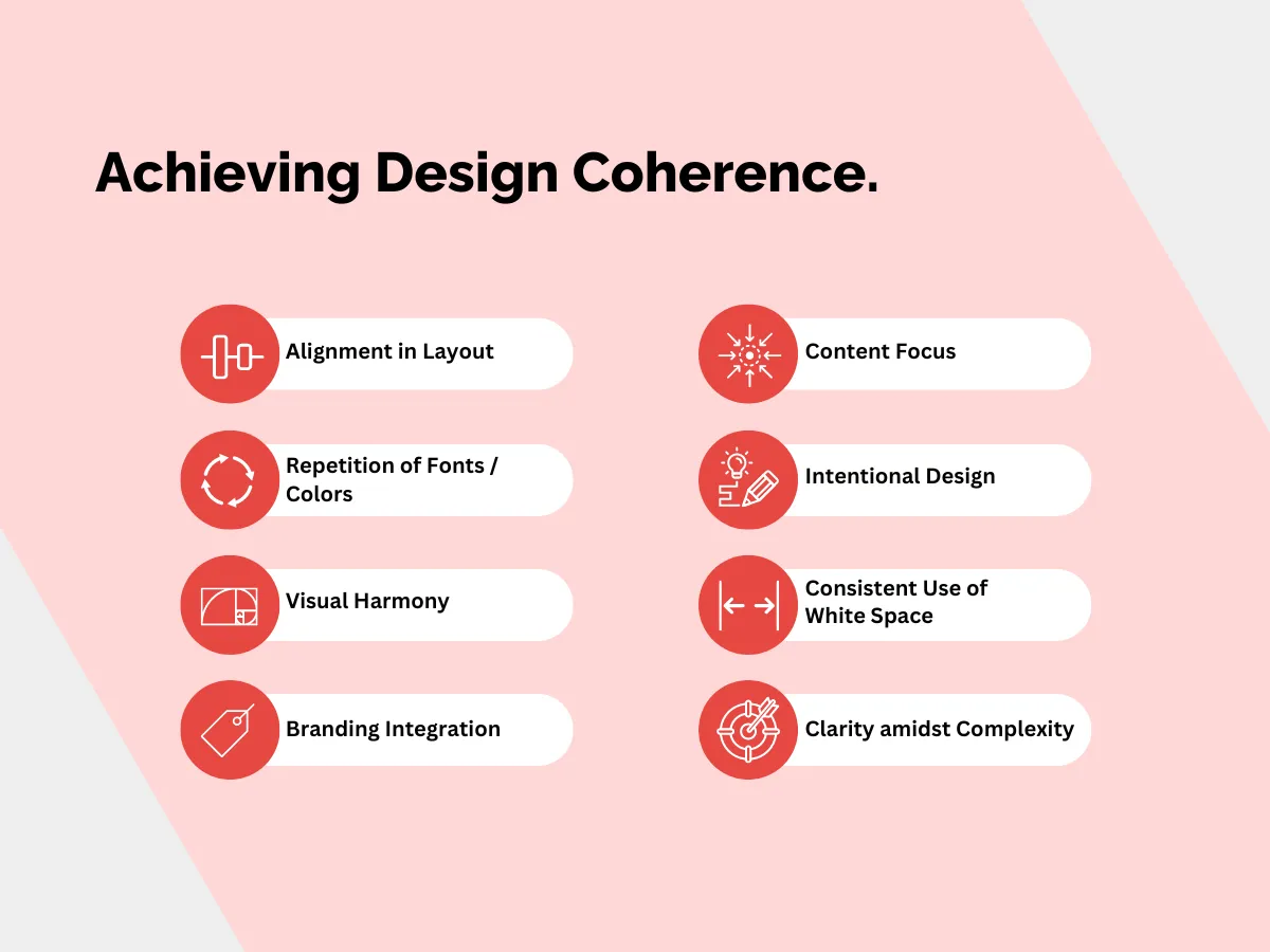
Design coherence entails the strategic and intentional use of design elements to forge a seamless, intuitive, and harmonious user experience. It serves as the cohesive force that binds the visual components of a website together, facilitating users’ navigation with ease and efficiency. A designer’s objective should be to achieve design coherence that enables users to traverse the experience seamlessly and intuitively.
For instance, consider a website where elements are utilised haphazardly, lacking clear purpose. The outcome may be a bewildering and disjointed user journey. Conversely, a website that maintains consistent use of fonts, colours, and layout fosters a sense of familiarity and ease for the user. For example, employing a specific colour for all call-to-action buttons aids users in intuitively locating clickable areas.
Design coherence fosters flow and continuity across all visual components. This is accomplished through layout alignment, strategic repetition of fonts, colours, and other elements, as well as overall visual harmony. Consistency in white space utilisation, typography, icons, imagery, and branding further reinforces coherence. These elements should complement each other rather than conflicting.
With a cohesive design, users can navigate pages efficiently, concentrating on content without distractions. It establishes order, guiding attention in ways that enhance usability.
In essence, coherence provides clarity amidst complexity. However, it’s essential to recognize that while the user experience should be a designer’s primary concern, there’s also space for self-expression and creativity. The challenge lies in ensuring that creative choices enhance, rather than hinder, usability and coherence. Approach designs with intention, balancing user experience with self-expression, to craft experiences that resonate with users.
Establishing Visual Hierarchies
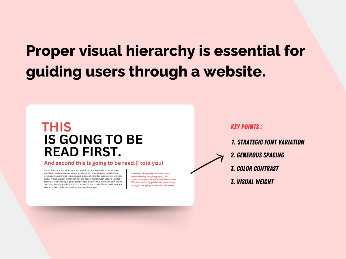
Proper visual hierarchy is crucial for users to quickly grasp what to prioritise and how elements are interconnected on a website. Without it, designs risk becoming chaotic and confusing, resulting in a disjointed user experience.
To illustrate the importance of visual hierarchy, imagine visiting a homepage where various elements compete for attention with no clear organisation. The logo, navigation menu, and promotional banners all appear equally prominent, creating a jumbled mess. Users struggle to discern where to click first or what content holds priority in such a scenario.
In contrast, envision another homepage with a well-defined visual hierarchy. The logo is prominent but not overpowering, leading users’ eyes to the navigation menu, which stands out due to its size and placement. Below, a featured banner catches attention, followed by smaller sections highlighting key content areas. Here, the hierarchy effortlessly guides users through the page, making navigation intuitive and content consumption seamless.
Effective hierarchy guides the viewer’s eye through strategic prioritisation of content. Varying font sizes and weights for titles and body text help distinguish levels of importance, with larger, bolder headings grabbing attention faster than smaller text. Space usage also plays a crucial role in establishing visual hierarchies, with generous spacing around certain elements isolating them as focal points amidst other content.
Leveraging colour contrast emphasises certain components, such as bright buttons against a muted background, while dark backgrounds make lighter text stand out. Visual weight, determined by elements with more visual mass like shapes and imagery, also impacts hierarchies by drawing the eye in.
However, it’s essential to remember that while these tools are effective, they must be used in balance. Overuse or misuse can lead to visually overwhelming and confusing design. The challenge lies in using these tools effectively to guide the user’s attention without overwhelming them.
In essence, establishing visual hierarchies is about creating clarity in complexity. It’s about approaching design with intention, balancing user experience with aesthetic appeal, to create experiences that make sense to the user.
Incorporating Effective Contrast Principles
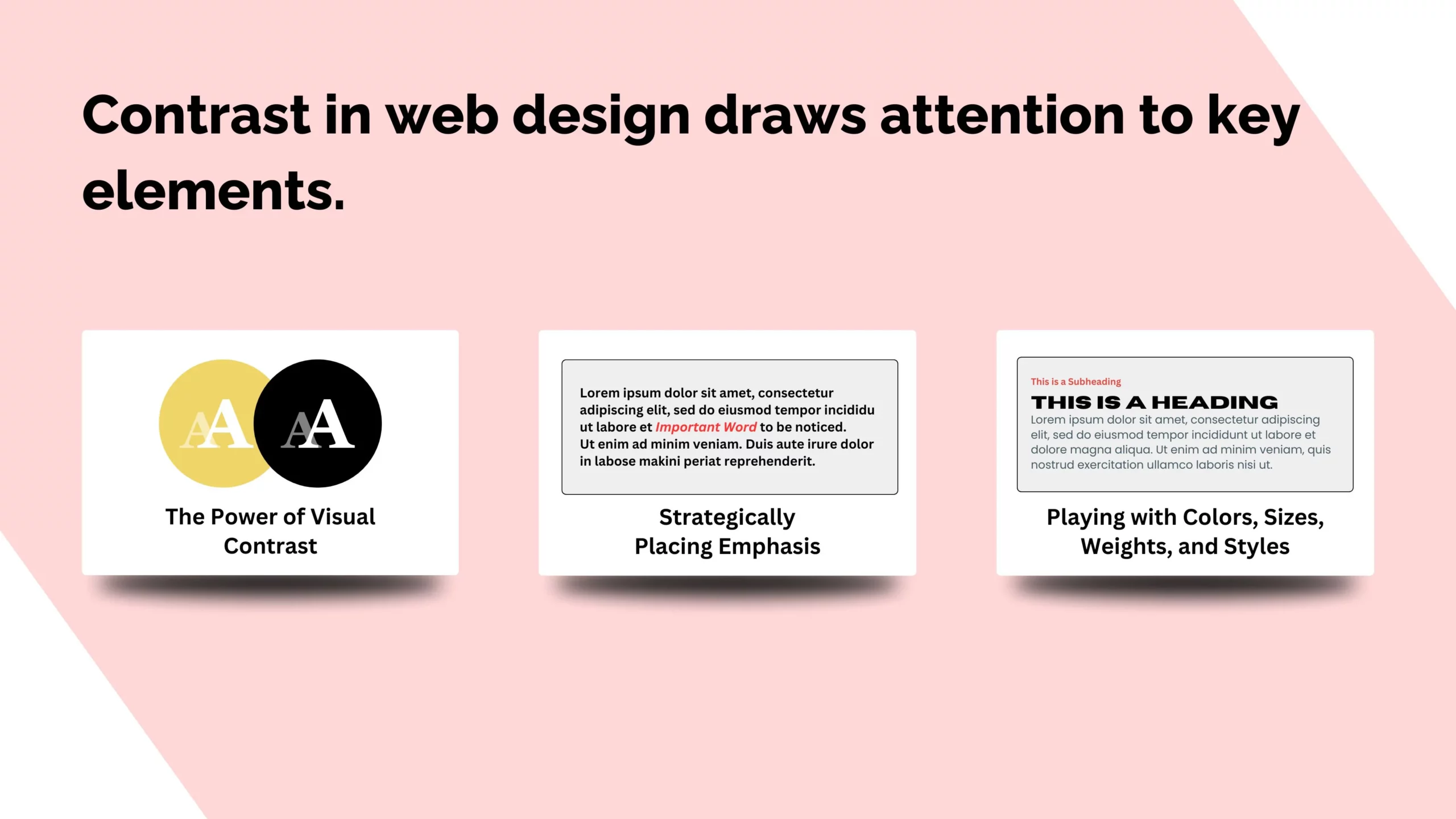
Ever found yourself drawn to that one sentence in a book that’s been highlighted in a bright, bold colour? It’s like a magnet for your eyes, pulling you in without even realising it.
That is the power of creating a visual contrast, you’re essentially drawing attention towards a specific thing by making it significantly different from the rest.
As a web designer, your mission is to harness this magic of contrast to make sure the important stuff doesn’t get lost in the shuffle. It’s all about strategically placing emphasis on key elements, making them impossible to ignore.
But here’s the fun part– there’s no one-size-fits-all approach. You get to play with a mix of colours, sizes, weights, and styles to create a visual harmony that guides your audience through your content effortlessly.
And guess what? It’s not just about making things look pretty; it’s about prioritising the user experience. By cleverly highlighting certain elements, you’re helping your users navigate with ease, ensuring they find what they need without breaking a sweat.
The Takeaway: Master the Basics, Then Make Them Your Own
Learning fundamental design principles gives you a solid foundation, but that’s just the starting point. Don’t let the “rules” restrict your creativity. Take risks and break out of your comfort zone!
For instance, play with unexpected colour combinations or funky fonts. Overflow your pages with textures, graphics, and animations if that’s your vibe. Go minimalist instead with massive amounts of whitespace.
Whatever you do, make it distinctly YOU. The heart and soul you pour into your designs is what elevates them from ordinary to extraordinary.
So get out there and soak up all the typography tips, colour wisdom, and contrast expertise you can. Immerse yourself in the building blocks. Then, throw in your secret sauce and whip up designs that wow!
With your aesthetic instincts and the fundamentals as your trusty toolkit, you’ll dream up websites that not only look exquisite but transform how people interact with the digital landscape. And that’s where the real magic lies.