
Imagine yourself relaxing on a beach towel, gazing out at the vast ocean. Sunbathers sprawl out in all directions, their colourful umbrellas and beach bags creating a sea of visual noise. It’s hard to focus on anything specific. Suddenly, a group playing volleyball catches your eye. They’re not perfectly centred in your view, but positioned slightly off to the left, near the intersection point where the horizon meets the beach. Their movement and lively colours naturally draw your attention.

The Rule of Thirds works on your website in a similar way. Think of your homepage as that crowded beach scene. Without any organisation, elements like text blocks, images, and menus can fight for attention, overwhelming visitors and making it difficult for them to find what they’re looking for.
The Rule of Thirds acts like a beach lifeguard, ensuring everyone has a good time. It can guide visitors, creating a clear and engaging experience.
Imagine a bustling school playground at lunchtime. Normally, it might seem like a chaotic scene of kids running in all directions. But look a little closer. Our eyes naturally gravitate towards certain areas.
Perhaps a group playing a frisbee game catches your attention. They’re not perfectly centered in the playground, but instead positioned slightly off to the side, near the edge of the shaded area under a large tree (one of our imaginary dividing lines!). Their movement and excited shouts naturally draw your attention.
This natural tendency for our eyes to be drawn to off-center elements is what the Rule of Thirds is all about.
Just like the frisbee game on the playground, the Rule of Thirds suggests placing key elements on your website slightly off-center, often near the intersection points created by dividing the page into thirds (both horizontally and vertically). These areas become like prime spots on the playground, naturally guiding your visitors’ eyes to the most important information you want them to see, whether it’s a captivating product image, a clear call to action button (“Sign Up Now!”), or an informative headline.
The Basics of the Rule of Thirds in Design
Explanation of the Rule of Thirds:
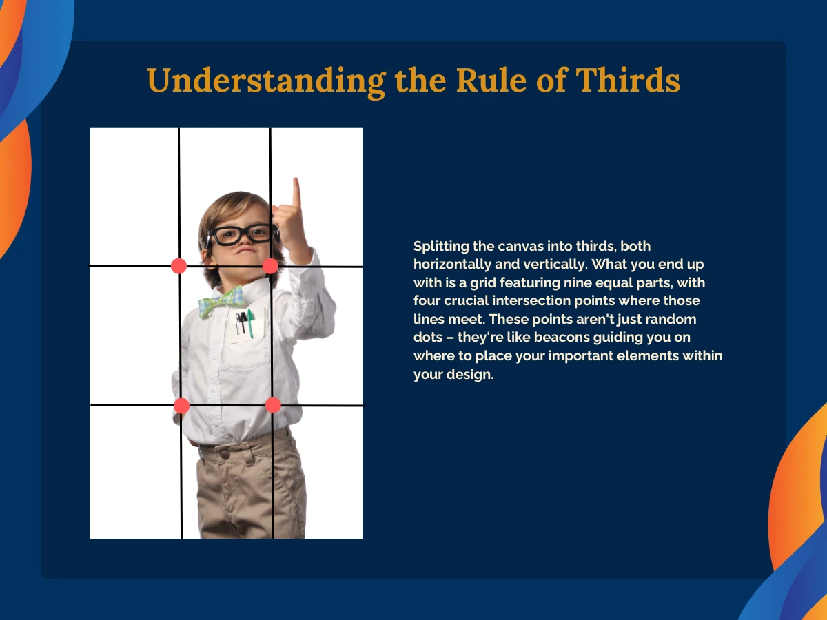
Alright, let’s break down this Rule of Thirds concept. Imagine your design space as a canvas waiting to come to life. Now, envision splitting that canvas into thirds, both horizontally and vertically. What you end up with is a grid featuring nine equal parts, with four crucial intersection points where those lines meet. These points aren’t just random dots – they’re like beacons guiding you on where to place your important elements within your design.
Importance in Web Design:
Now, why should you care about this rule in the realm of web design? Well, let me tell you, it’s revolutionary. By following the Rule of Thirds, you’re essentially creating signposts for your visitors. You’re leading their eyes to where you want them to look first, second, and so on. This strategic element placement isn’t just about making things look pretty; it’s about creating focal points that grab attention, improving content readability, and ultimately enhancing user engagement. It’s like giving your website visitors a guided tour rather than letting them wander around aimlessly.
Examples from Photography and Art:
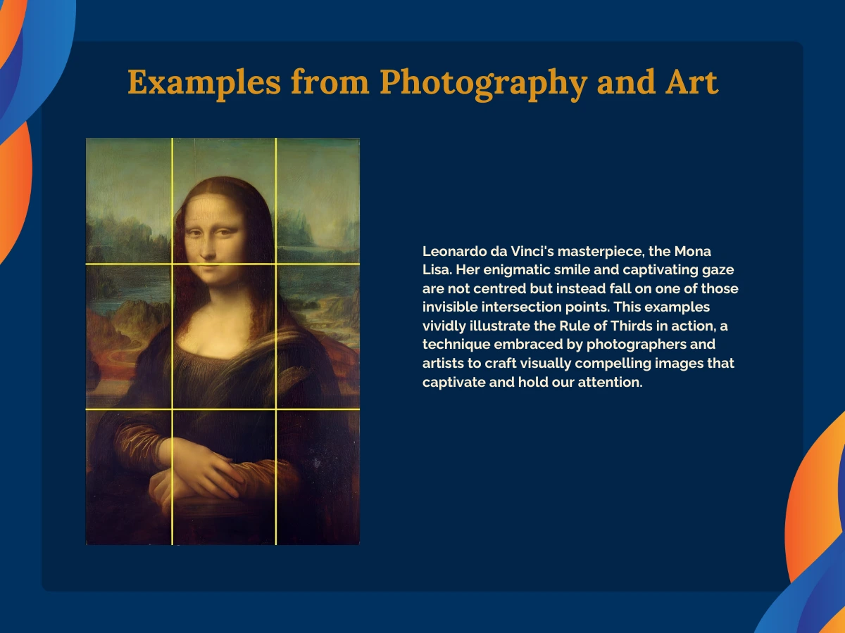
Consider Henri Cartier-Bresson’s iconic photograph “Behind the Gare Saint-Lazare,” capturing a dynamic moment of a man mid-leap over a puddle. Notice how the subject isn’t perfectly centred but instead positioned near one of the grid’s intersection points, creating a sense of movement and energy. Similarly, think of Leonardo da Vinci’s masterpiece, the Mona Lisa. Her enigmatic smile and captivating gaze are not centred but instead fall on one of those invisible intersection points. These examples vividly illustrate the Rule of Thirds in action, a technique embraced by photographers and artists to craft visually compelling images that captivate and hold our attention.
And here’s the exciting part – this same principle can be seamlessly applied to web design.
Practical Applications in Web Layouts
Grid Layouts and the Rule of Thirds:
It’s time to talk about how to practically apply the Rule of Thirds to your web layouts. Grid layouts are your best friend here. By using the Rule of Thirds grid, you’re essentially setting up a framework that ensures your content is structured and distributed in a visually pleasing manner. Picture each section of your website fitting neatly into one of those nine equal parts. It’s like organising your content into little compartments, making everything feel cohesive and balanced. Plus, it helps you avoid that dreaded cluttered look that can turn visitors away faster than you can say “back button.”
Strategic Placement of Elements:
Let’s get down to the nitty-gritty: where to place those key web elements. Remember those intersection points we talked about earlier? Well, they’re your secret weapons for capturing viewer attention. Think about it – when someone lands on your website, where do you want their eyes to go first? Maybe it’s your eye-catching call-to-action button or your sleek navigation menu. By strategically placing these elements at or near those intersection points, you’re practically guaranteeing that visitors’ eyes will be drawn to them like moths to a flame. It’s all about making sure your most important elements stand out in all the right ways.
Balancing Text and Images:
Ah, the age-old struggle of balancing text and images. Lucky for you, the Rule of Thirds is here to save the day. Use the grid to your advantage when deciding where to place text and visual elements on your website. Maybe you want to position your headline text along one of those horizontal gridlines, with a striking image taking centre stage in one of the larger grid sections. Or perhaps you want to break up a block of text with an eye-catching image placed at one of the intersection points. Whatever your layout goals may be, the Rule of Thirds can help you achieve that perfect harmony between text and images, elevating the overall user experience in the process.
Enhancing Visual Hierarchy with the Rule of Thirds
Have you ever come across a website that feels cluttered and, therefore, confusing? It’s hard to know where to look first, and you end up feeling lost. That’s where something called visual hierarchy comes in.
Defining Visual Hierarchy:
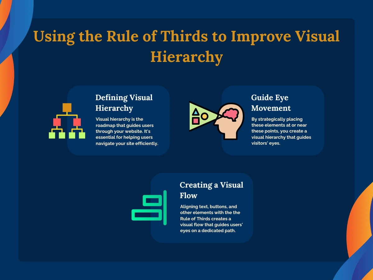
Visual hierarchy is like the roadmap that guides users through your website. Think of it as creating a visual flow that tells visitors where to look first, second, and so on. It’s essential for helping users navigate your site efficiently and intuitively. For example, headlines are usually larger and bolder than body text, making them stand out and signalling to visitors that they’re important.
Using the Rule to Guide Eye Movement:
Imagine a website bursting with information, but lacking a clear direction. Visitors, overwhelmed by the chaos, don’t know where to look first, leading to a frustrating and unproductive experience. The Rule of Thirds steps in as the hero, transforming this jumble into a clear and engaging conversation.
By dividing your website’s layout into a grid of nine sections with four key intersection points, the Rule of Thirds empowers you to strategically place website elements. Think of these points as spotlights, where you can showcase your most important content – a captivating product image, a bold headline summarising your service, or a clear call to action button like “Shop Now!”. Visitors’ eyes are naturally drawn to these areas, creating a visual hierarchy that prioritises the information you want them to see first.
The beauty lies not just in grabbing attention, but also in guiding visitors through your website. By aligning text, buttons, and other elements with the grid lines, you create a visual flow that acts like a gentle nudge, guiding their eyes on a predetermined path.
Tips for Implementing the Rule of Thirds in Web Design
Starting with a Grid
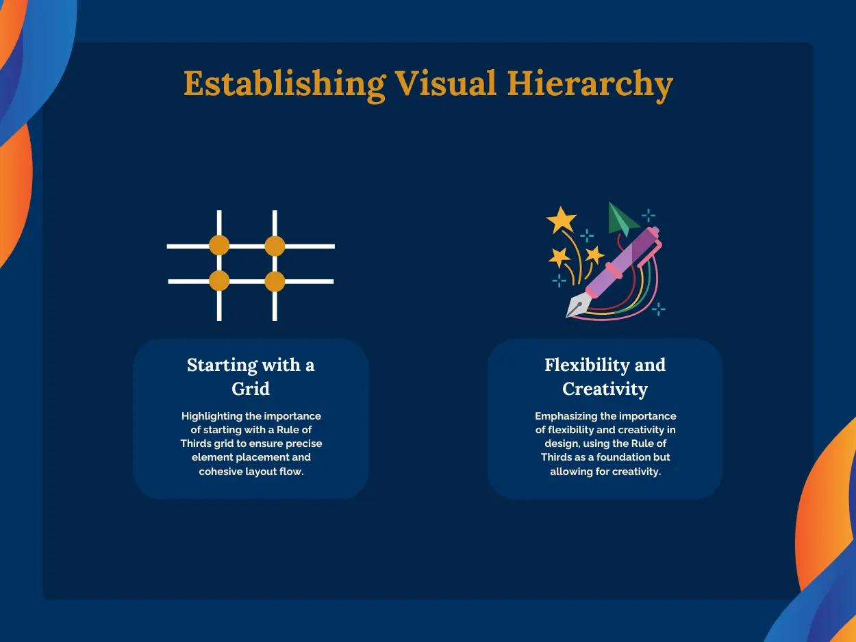
Picture this: you’re starting a new web design project, and you’ve got a blank canvas staring back at you. Where do you begin? Well, here’s a tip: start with a Rule of Thirds grid overlay. Seriously, it’s like having a guiding light in the darkness. By laying down this grid during the mock-up phase, you can plan out your element placement with precision. It’s like drawing the skeleton of your design before adding the flesh and blood. Plus, it helps you ensure that everything is aligned just right and that your layout flows seamlessly from one section to the next. So, don’t skip this step – trust me, it’ll save you a ton of headaches down the road.
Flexibility and Creativity
Now, here’s where things get interesting. While the Rule of Thirds is a fantastic guideline, it’s not set in stone. In fact, it’s more like a gentle nudge in the right direction. So, as you’re designing your website, remember to embrace flexibility and creativity. Don’t be afraid to deviate from the grid if it benefits the overall composition and user experience. Maybe you want to break the grid for a dramatic effect or to highlight a specific element. Or perhaps you want to experiment with asymmetrical layouts to add a bit of visual interest. The key is to use the Rule of Thirds as a foundation but to let your creativity soar. After all, the best designs often come from thinking outside the box.
Conclusion
In wrapping up our exploration of the Rule of Thirds in web design, let’s take a moment to recap its myriad benefits and offer some parting words of wisdom.
By applying the Rule of Thirds to your web design endeavours, you’re essentially unlocking a treasure trove of advantages. Firstly, this principle serves as a cornerstone for creating visually engaging websites. It provides a structured framework that helps you organise your content in a way that is not only aesthetically pleasing but also intuitive for visitors to navigate. From focal points that capture attention to balanced layouts that enhance readability, the Rule of Thirds ensures that every element on your website serves a purpose and contributes to the overall visual appeal.
However, it’s important to remember that while the Rule of Thirds provides a valuable guideline, it’s not meant to be a rigid rulebook. Designers should feel empowered to experiment with this principle, adapting it to fit their unique design style and the specific needs of their web projects.